
Optimising Reviewbah's Data Content For Higher Efficiency
Making our team's work to be more efficient and productive by simplifying complex data content into intuitive dashboard interfaces.
Team
Poong Ka Vui
Chiew Jian Zhi
Amanda Chong
Role
Hi-Fidelity Design
Visual Design
Product Strategy
Year
Jan 2024 (3 weeks)
Tools
Figma

Overview
Our team has decided to create an admin dashboard for our customer review app - Reviewbah, in order that the teams can better managing the platform's user reviews, analytics, revenues and more.
I took on the admin dashboard project with my main role being the product strategy and visual design, and being the only designer on this project team, together with a back-end developer and a product manager, communication was vital for us to achieve clarity and understanding on the project.
Why We Need It
Better managing data content efficiently
Reviewbah has been expanding from being simply not just an app for customers to search or write helpful reviews but being able to purchase products on the platform via Reviewbah wallet in the future.
Because of that, a simple and centralized platform for managing user activities, analytics, metrics, data imports and exports is important for team members to make data-driven decisions and oversight over the platform they manage.
The Solution
Intuitive & understandable data interfaces for faster performance
1
Simple data presentation with clear visual hierarchy
-
Teams can faster analyze presented data reports
-
Intuitive and easy to navigate
2
Manage user data and metrics
-
Track user signups, demographics, purchases etc.
-
Better understanding of user activities and behaviors
3
Manage transactions and purchase history
-
Record and track transaction histories of users and merchants via ID names
-
Wallet transparency for easy account management
Problem Statement
As an admin dashboard designer, I want to easily present all the data through intuitive design interfaces, so that it allows admins to access information at ease.
Research
A comprehensive overview of important data content for easy interaction and navigation
I conducted some research on some articles and blogs and I came across similar key insights on how to create an admin dashboard effectively by presenting the important data on a single screen on the basis of optimizing the team's work.
Some common features to be included would be the following:
Able to manage
user profiles
Manage user's activities
and transactions
Take intervention
against users that aren't complying
Send out push notifications and messages for marketing purposes
Content and product management
Audit log, security, and permissions
Designing The Product
At first, a simple product would be feasible for a small startup
Together with a full-stack developer and a back-end developer, we've come to a conclusion on making the admin panel as easy as possible since we're a small startup consists of 5 people, so, creating an easy-to-use, simple interface admin panel to showcase data content would be feasible for us to do.
We discussed a few of the functions that needed to be added into the admin panel:
Product listings
-
List of products
-
Edit product
-
Name
-
Category
-
Description
-
Status
-
Price
-
Date created
-
Stock
-
Remarks
-
Users
-
List of users
-
Edit user
-
User orders
-
Transaction history
-
Wallet amount
-
Date joined
-
Affiliate status
-
Retention rate
-
Activity
-
Vouchers
-
List of vouchers
-
Edit vouchers
-
Status
-
Created by
-
Date created
-
Validity
-
Wallet
-
User wallet status
-
Balance
-
Top up
-
Withdraw (Merchant only)
-
Transaction history
-
Merchant revenue
-
Orders
-
List of orders
-
Edit orders
-
Status
-
Date created
-
Product purchased
-
Merchant name
-
Amount
-
User order
-
Reviews
-
User reviews
-
Total reviews
-
Written by
-
View count
-
Date written
-
Merchant name
-
Affiliate status
-
Framework
Evaluating the priority of data content is key to establishing clarity among team members
In order to have an unified understanding of what, how and why the admin panel plays an important role in optimizing data information, we discussed why and how a team member would use if for in terms of making data-driven decisions to benefit our Reviewbah platform.
Here we decided 3 of the most important data contents for us to focus on.
Product listing
details
Sales
(orders, transactions)
Users and their
activities
Improvements
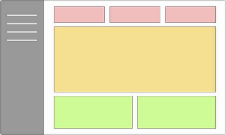
2 major improvements in the design
Based on the feedbacks my teammates had given to me, I iterated the design over 2-3 days with 2 major improvements. I've come up with this layout design below to accommodate with the decision being made.

-
(1st Tier) Yellow section: This is where the main important data are being presented in numbers, graphs, charts etc.
-
(3rd Tier) Green section: Data that consists of many texts and details (e.g purchase history).
-
(2nd Tier) Red section: A brief summary of data that are presented in numbers, charts or graphs.
1. Add a comprehensive overview of data content on the dashboard option
-
Based on the feedback received, having the summary of the important data by category at first glance is more desirable.
-
Having consistency in layout is helpful for users to navigate the dashboard
2. Present all of the desired options on the menu
-
We discussed that it'd help the teams a lot in navigating to the options where they'll visit the most at one click and reducing cognitive load too.
-
Ability to toggle between days and weeks for comparing overall performance.
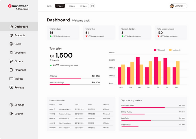
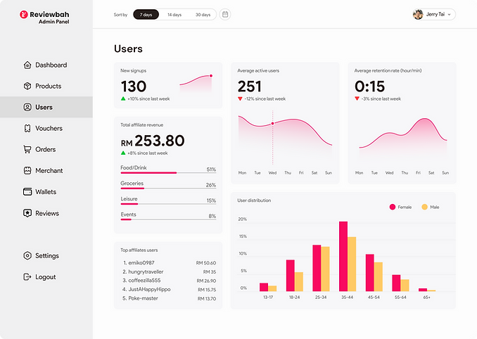
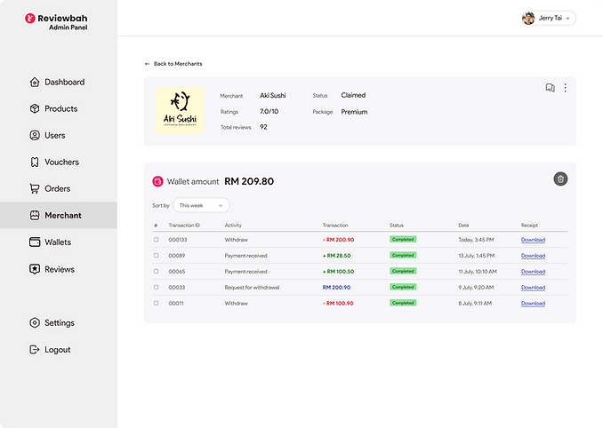
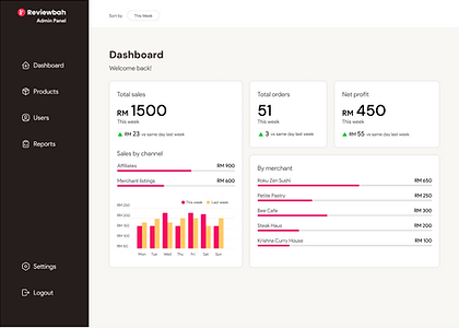
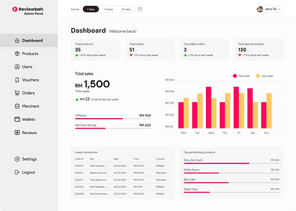
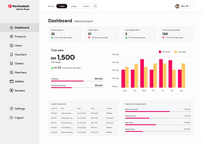
Final Screens
The final product


Reflections & Lessons Learned
Things I'd do differently next time
-
Keep asking questions before doing. During this project I didn't consult with my team members much often about what functions or commands should be included in the project and how it should be planned (since they're super busy). Thus I went ahead with the project and resulted in me doing a little bit too much from what they expected. Next time I'd consult with them before starting to designing any projects in the future.
-
Be purpose driven. Not (only) project driven. I noticed I was more focused on the "what" rather than the "why" aspect of the project, resulting in me losing touch of the intention behind creating and designing the product. So, with the user in mind, I hope to become stronger in communicating my product design with a designated purpose.
Thank you so much🩵
Let's get in touch via⬇️


